Project Reveal: Mid-Century Condo Re-Design
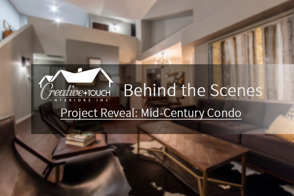
We are so excited to reveal this finished project! We’ve been sharing the progress of this project through a series of posts to illustrate the 15-step process that we apply to all our interior design and home renovation projects.
These steps are grouped into 3 phases:
- Behind the scenes (project planning)
- Performance (project execution)
- Wrap up (final touches and reveal)
As the project moved through the final phase, the following steps were completed:
Phase 3 – Wrap Up
- Client reveal (our favourite part!)
- Deficiencies walk through
- Client closure meeting
- Follow-up to ensure client satisfaction
This was a special project for us, we especially want to thank the homeowner Don, for trusting our team to bring his ideas to life! Following is a full description of the finished project.
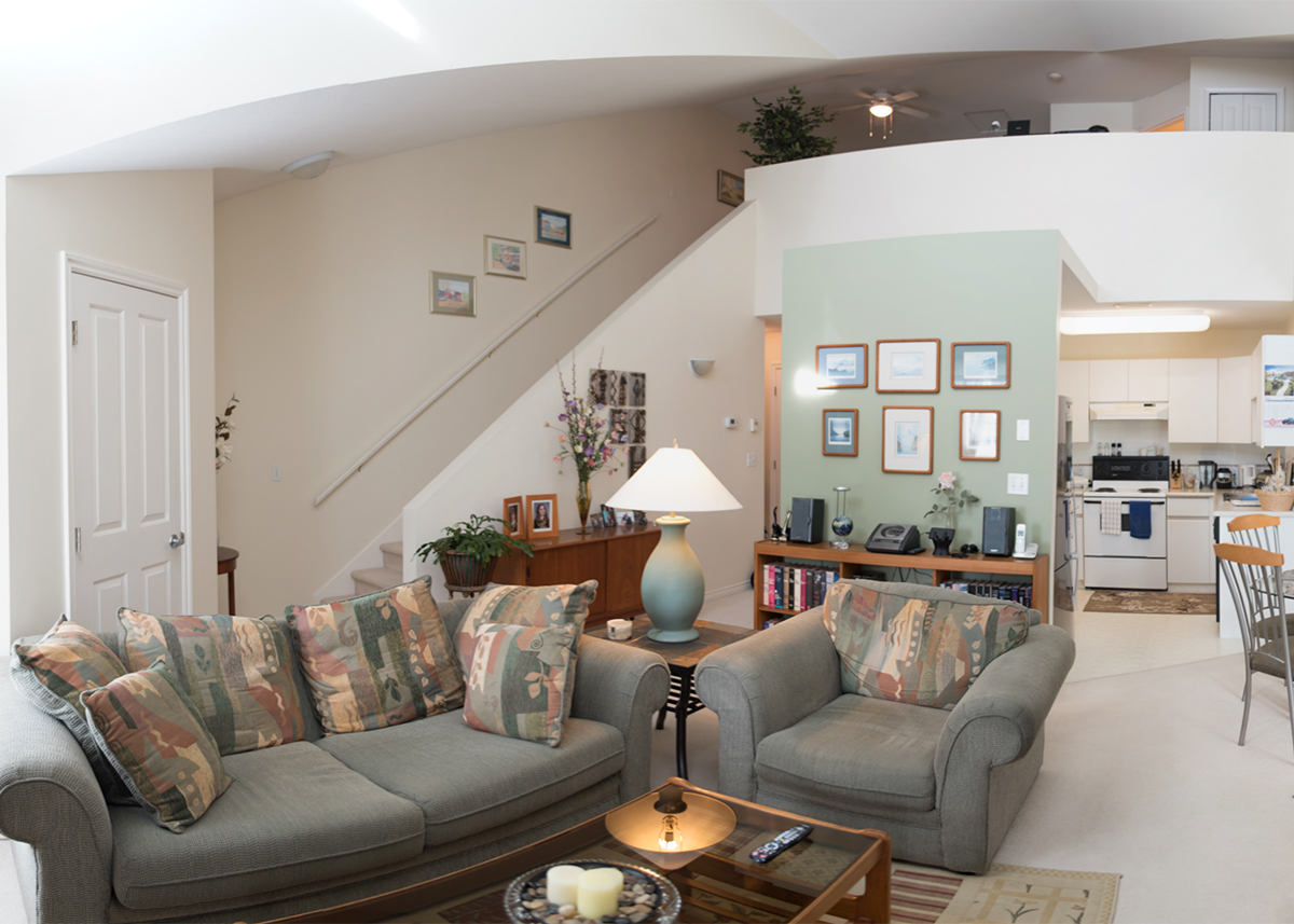
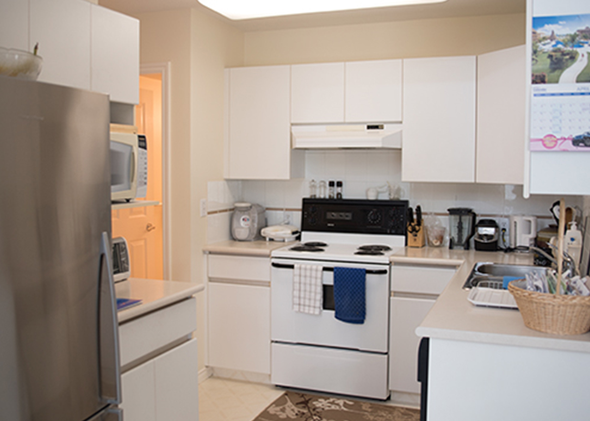
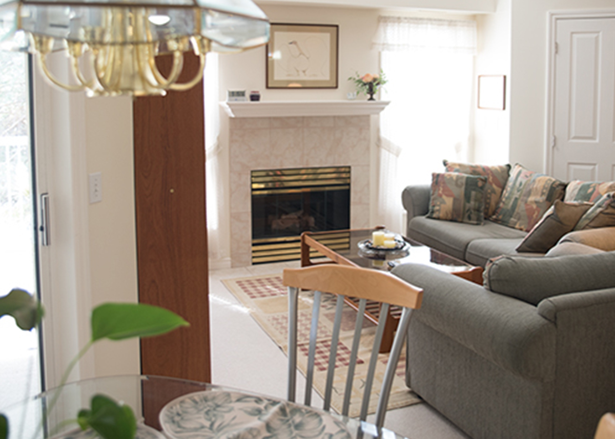
The homeowner contacted Creative Touch Interiors to update his worn & tired 20-year-old home. He loved the location and didn’t want to relocate, but knew the place could use a makeover. He also had lovely pieces of furniture passed down from his mother that he wanted to keep. These served as the inspiration for the design and homage to his mother’s memory. No major construction challenges were encountered, structural changes were minimal with only a few walls being removed.
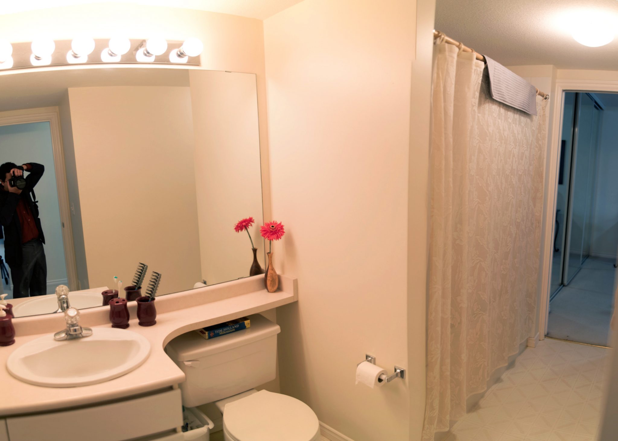
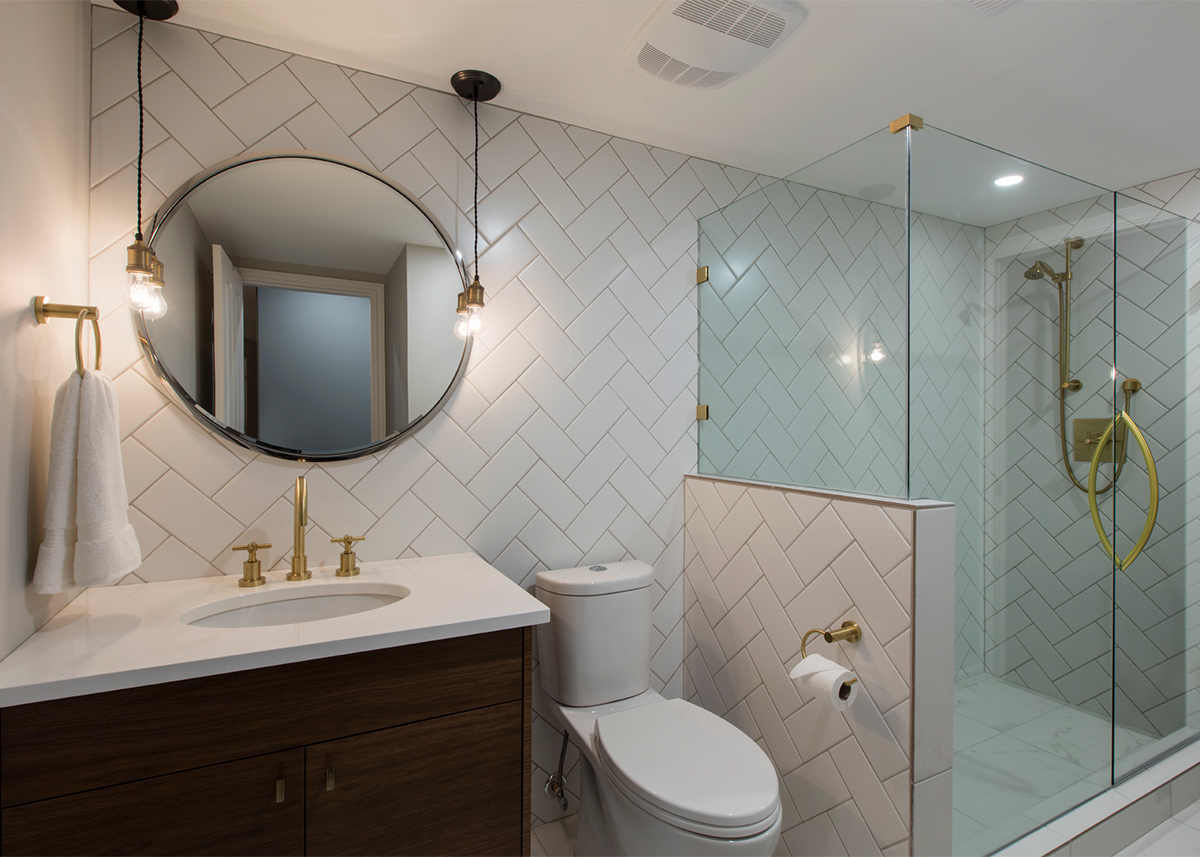
Keeping the original floor plan made efficient use of space a priority. The upstairs bathroom was enlarged and separate entertainment and reading spaces were created on the second floor. Functional space planning was paramount, with purpose built into every corner. Reduced clutter and increased function created an overall open feeling.
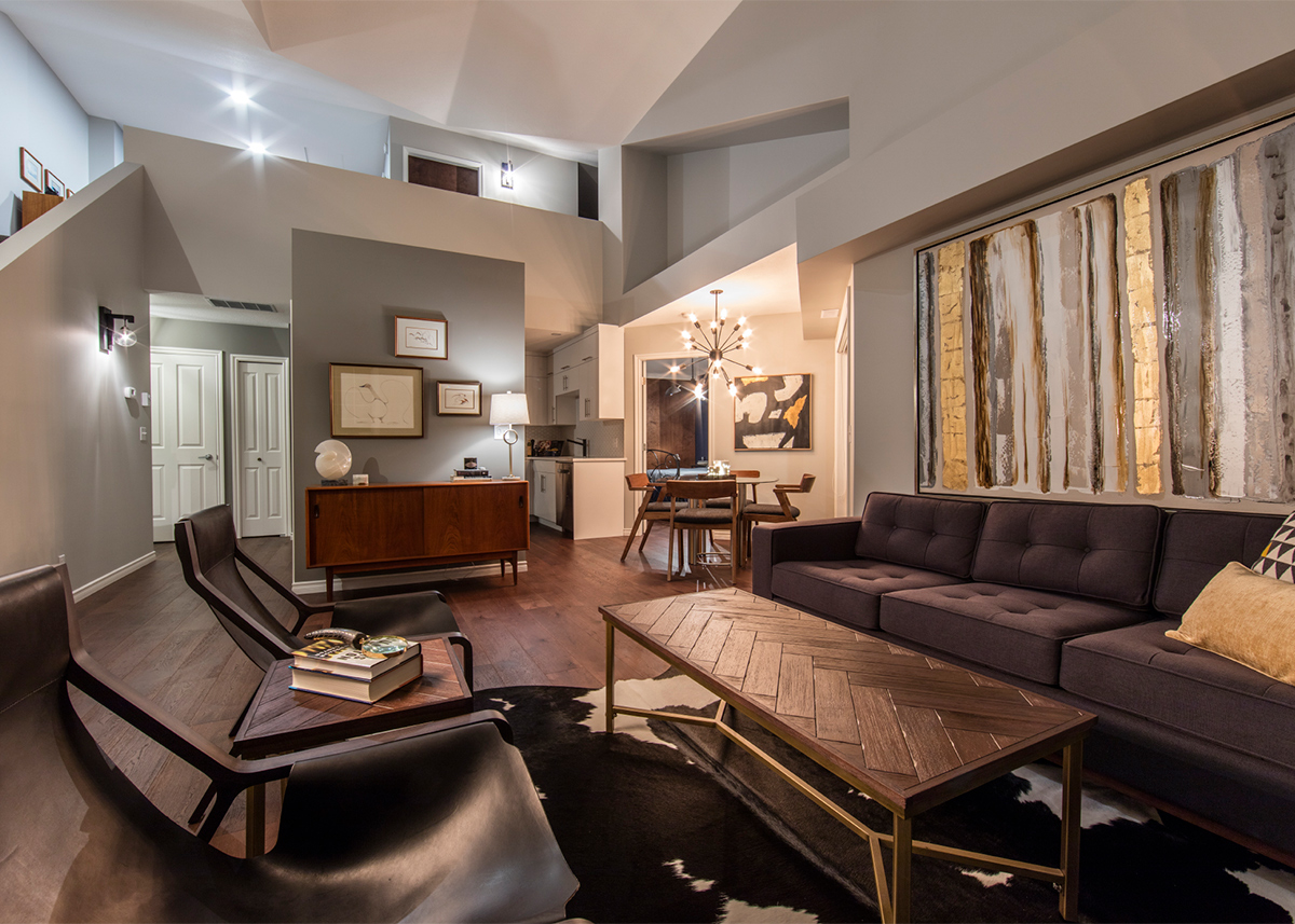
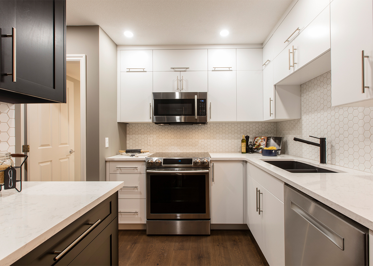
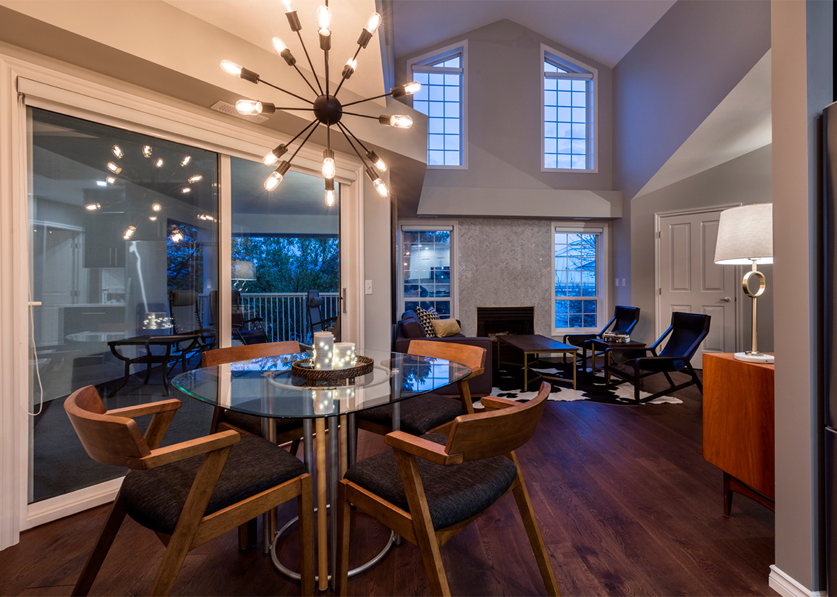
Attention to detail and careful planning resulted in creative finishing details such as geometric tile work, two-toned kitchen cabinets and unique lighting fixtures. Vintage oak engineered flooring, satin brass & matte black faucets, and mid-century style furniture came together to create a true reflection of the homeowner’s tastes. As a retired math teacher, he greatly appreciated the balance of lines and geometry.
Special care was taken to combine new and existing materials and details into a cohesive design. A mid-century teak hutch that belonged to the homeowner’s mother inspired the entire scheme. Incorporating existing furniture into the design, such as the hutch, bookshelf and family business “Treadgold Paint Supply” sign pulled a lot of the client’s personality into the space.
To improve energy efficiency & comfort new exhaust and ceiling fans, LED lighting, and energy star appliances were installed. The old carpet was removed and motorized blinds were installed on the large living room windows for easier climate control. Only low VOC paint was used.
Communication is always a key component in the process. The client was informed & involved through the entire project from planning to execution. We launch every project with an introductory briefing meeting for our trades and continue to collaborate as a team throughout the project. Our unique approach of combining interior design & project management allowed us to affectively execute this renovation with a beautiful end result!
“I knew I wanted to update my home, but when I realized it was going to take a complete re-design I also knew that I needed some help. I had a few ideas about what I wanted but it was Paulette & Hannah’s expertise in coming up with the plan and the specifics that really pulled it all together. I hardly said no to anything because everything they did was so fantastic! They did a phenomenal job of incorporating my mother’s furniture into the design as well as other pieces of my family history that were important to me. I very much appreciated their attention to detail and was really impressed by their excellent taste and judgement. Thank you Paulette & Hannah for a great experience and an amazing end result, I truly love it.”
Don Treadgold
Kelowna, BC


